
Speedo
Design System
Overview
A robust design system serves as the foundation for scalable, consistent, and efficient design. My objective was to create a unified design language that optimized collaboration between designers, developers, and stakeholders to streamline workflows, reduce inconsistency, and ensured a seamless user experience across platforms.
Design Lead
UX Researcher
UX/UI Designer
Figma
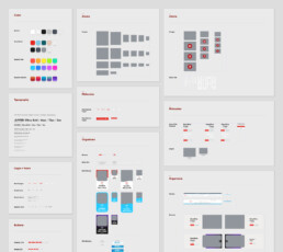
Design library
Design System Guidelines
Audit the current design system and user experience. Use findings to build, from the ground up, a new system and a centralized asset library in Figma, encompassing reusable components, a master color palette, typography guidelines, and comprehensive documentation. Ending with an evaluation of the new system's performance.
Discovery + Research
When I sat down at my desk for the first time at Speedo, there was a sparse, neglected e-com style guide waiting for me. And I discovered later, past digital design teams took this guide as more of a suggestion and mostly did what they wanted. I had an upwards battle in front of me. Thus, I began a deep dive into reworking the scraps I had into a fully-functional design system.
UX Audit
The first step was conducting a thorough audit of the existing experience. I analyzed the flow of the current system, identified bottlenecks, and evaluated feedback. This helped me uncover pain points and areas for improvement. I also looked at analytics and user data to ensure we address real needs rather than assumptions.
Workflow & Management Audit
A seamless workflow is crucial to any successful design project. I took my time to evaluate the current workflows and project management practices. This helped me spot inefficiencies and suggested better ways of working with teams, such as enhancing communication between designers and developers and streamlining approval processes.
UI Inventory
I then created a comprehensive and detailed inventory of the current UI components. This includes assessing their consistency, usability, and visual appeal. By systematically cataloging design elements, I could identify patterns, redundancies, and areas where the design system could be improved for more cohesion.
Collaboration with Stakeholders
I engaged with fellow designers, developers, and other team members to discuss pain points and frustrations they've experienced during the project. Understanding their perspectives helped me design solutions that are not only user-centric but also practical from a development and implementation standpoint.
— Common Findings —
Redundant Design Efforts
I discovered situations where multiple designers were working on similar features or interfaces, leading to duplicated efforts, misaligned outputs, and wasted resources.
Miscommunication Between Teams
There’s often a gap in understanding between designers, developers, and stakeholders which can delay projects and result in designs that aren’t feasible or that require extensive revisions.
Confusing or Unclear Copy
Copy can often be overlooked in the design process, but confusing language, inconsistent terminology, or missing instructions can frustrate users and make interfaces less intuitive.
Scaling difficulties
As the projects grew, maintaining a cohesive experience across multiple touchpoints and designers became increasingly complex and time-consuming.
Problems to solve
To summarize the findings by "How might we" questions
How might we
structure and organize the design system so that users can easily find out the correct components to use?
How might we
apply interaction in design system to help better visualize the real product in prototype and user testing?
How might we
transform traditional documentation into an interactive, living resource that evolves in real time as the design system grows?
How might we
create a design system that auto creates versions for all the viewports?
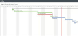
Timeline Planning
Before starting the design phase, I created a clear plan and an estimated timeline. This helped senior management understand resource prioritization, set expectations for the next steps, and align on the anticipated final outcome within a defined timeframe.
Ideate + Execute
Reworking the design system meant rebuilding scattered components into a cohesive, functional library. Using Figma as a collaborative hub, I involved designers, developers, and stakeholders to ensure the system was practical and user-focused. Workshops and iterations turned outdated scraps into a streamlined toolkit, ready to support any project.
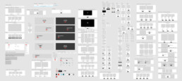
Building the Core Elements
A central aspect of the design system was the creation of reusable components, designed with flexibility and scalability in mind.
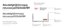
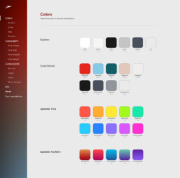
Color Palette
A master color palette was expanded upon, redefining colors for specific brands like Fastskin as well as creating all-new Speedo’s Kids line.
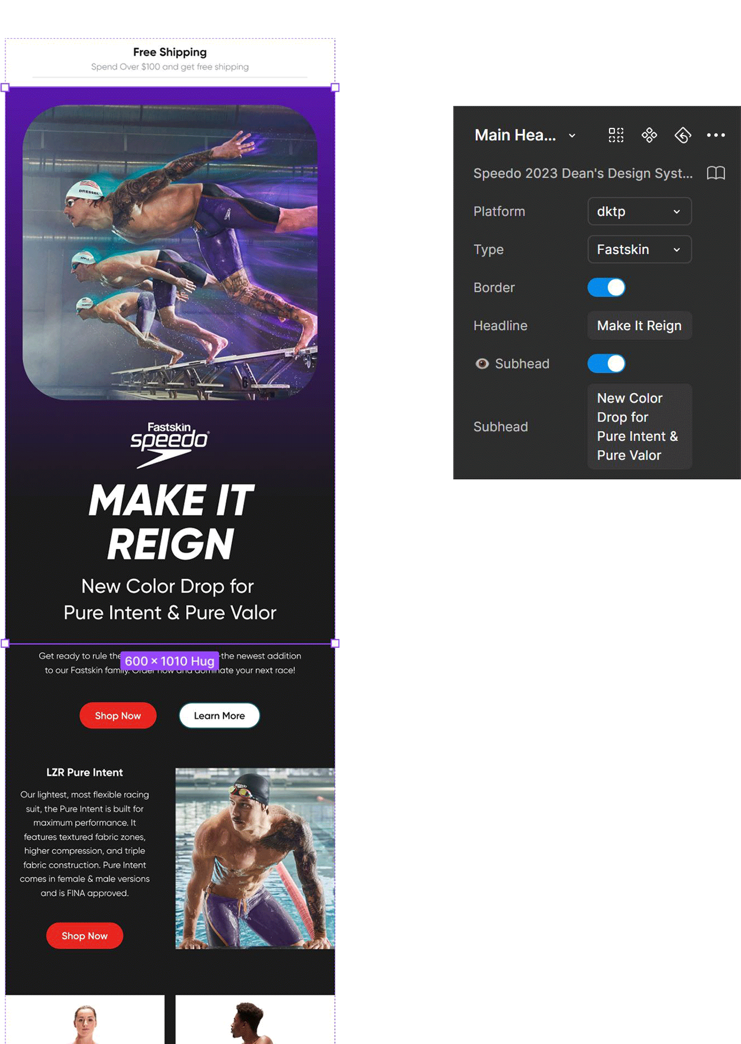
Configurable Components
Designers can effortlessly and intuitively configure specific components to the desired variations through the variant panel—allowing for different sizes, states (e.g., hover, active), and styles (e.g., primary, secondary). This approach ensured that each component could seamlessly adapt to various platforms (web, mobile, etc.) while maintaining consistency and reducing redundancy across the system.
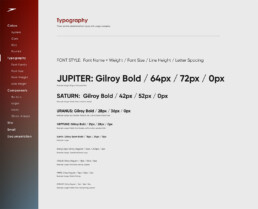
Typography Styles
Figma's typography styles were utilized to maintain consistency in font usage. By anchoring the design system in robust typography guidelines, we’ve ensured clarity, consistency, and a unified visual language that elevates the user experience.
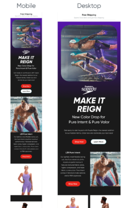
Scalable Layouts
Thanks to the auto-layout system, all components in the design system are fully scalable across different viewports. From mobile to tablet, desktop, and ultra-wide screens, designers can effortlessly adapt components to create UIs for any screen size.
Design System Structure
Our Figma master library is carefully organized, beginning with a detailed guideline on system usage, included best practices, design principles, and interactive examples. Adhering to atomic design principles, the library is structured from atom-level components through molecules, and organisms. Also included are supplementary resources such as documentation around copywriting, a UX wireframe kit, and instructions on how to add and grow the system.
Results + Takeaways
The new design system quickly became a trusted source, adopted and embraced across teams—streamlining design work, reducing inconsistencies, and speeding up workflows.
Regular collaboration sessions between the design and development teams were set up to ensure that feedback was incorporated into the system. This helped address concerns related to feasibility and provided an avenue for continuous improvement.
Key Takeaways
Design systems are dynamic entities that require collaboration, iteration, and continuous refinement. By laying a solid foundation and focusing on accessibility, scalability, and clarity, we built a system that not only supports current needs but also prepares the team for future challenges.
Cohesive User Experience
Consistent interfaces across platforms strengthened the brand identity and improved accessibility.
Efficient Collaboration
Clear guidelines aligned design and development teams, enabling smoother handoffs and reducing QA iterations.
Faster Time-to-Market
Simplified workflows and reduced redundancies enabled quicker delivery of updates and new features.
Scalability and Growth
The system easily adapted to new features and tools, establishing a solid foundation for future innovation.
Stakeholder Confidence
Consistent processes and clear outcomes built trust in the design system across teams and stakeholders.
Streamlined Processes
Centralized components and guidelines minimized duplication, reduced errors, and accelerated prototyping and iteration cycles.